


#2594 closed enhancement (done)
Better axis scaling in scatter plot and related charts
| Reported by: | bburlacu | Owned by: | mkommend |
|---|---|---|---|
| Priority: | medium | Milestone: | HeuristicLab 3.3.14 |
| Component: | Visualization.ChartControlsExtensions | Version: | 3.3.13 |
| Keywords: | Cc: |
Description (last modified by bburlacu) 
Often chart axes need to be scaled according to the value range. This is done by setting reasonable min and max values and an interval between tickmarks. For example, the existing scaling in the scatter plot calculates the min and max of the data and then scales them by 20% (max *= 1.2, min *= 0.8), while the number of tickmarks is always set to 5. The downside of this method is excessive scaling (eg., when max is large, 0.2 becomes significant).
We suggest another approach for scaling, where the axis minimum, maximum and interval are calculated according to the position of the most significant fractional digit of the minimum value, and of the interval calculated as interval = range / ticks. This ensures that the tickmarks are always multiples of the interval and rounded to the most significant digit.
Examples:
- Old scaling


- New scaling:


Change History (28)
Changed 9 years ago by bburlacu
Changed 9 years ago by bburlacu
Changed 9 years ago by bburlacu
Changed 9 years ago by bburlacu
comment:1 Changed 9 years ago by bburlacu
- Description modified (diff)
- Status changed from new to accepted
comment:2 Changed 9 years ago by bburlacu
comment:3 Changed 9 years ago by bburlacu
- Owner changed from bburlacu to mkommend
- Status changed from accepted to reviewing
comment:4 Changed 9 years ago by bburlacu
r13807: Fix bug in Decimals methopd causing an infinite loop when the value is zero.
comment:5 Changed 9 years ago by gkronber
- Owner changed from mkommend to bburlacu
- Status changed from reviewing to assigned
The improvements to the scaling are a good idea. So, thanks for improving this!
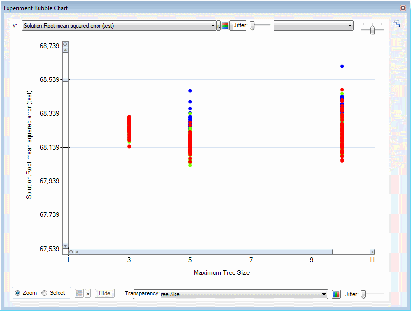
However, I experienced a problem in the bubble chart after the changes in this ticket. Now, when I use the 'jitter'-feature in the bubble chart the scaling causes the points in the plot to jump around extremely. I think the automatic scaling for the bubble-chart with jitter should be therefore be handled specifically.
(See attachments, because of the new axis scaling the right hand side points are not visible after jittering)
Changed 9 years ago by gkronber
Changed 9 years ago by gkronber
comment:6 Changed 9 years ago by gkronber
Another issue that has been introduced is handling of grid-lines in the bubble chart (after zooming in and then zooming out again, see attachment).
Changed 9 years ago by gkronber
comment:7 follow-up: ↓ 8 Changed 9 years ago by bburlacu
- Status changed from assigned to accepted
@gkronber: none of the changes under this ticket affected the bubble chart. the same issue occurrs in the download version of HeuristicLab, when changing the jitter value while the chart is zoomed in (this is also responsible for the grid lines artifact: zoom in, apply jitter, then zoom out). as far as I can tell the issue you reported has nothing to do with the axis scaling suggested here. will have a deeper look to find the real culprit for this issue.
comment:8 in reply to: ↑ 7 Changed 9 years ago by gkronber
Replying to bburlacu:
@gkronber: none of the changes under this ticket affected the bubble chart.
OK, thanks
comment:9 Changed 9 years ago by bburlacu
r14007: Fixed small scaling bug when calculating the necessary decimals for the axis interval.
comment:10 Changed 9 years ago by bburlacu
r14008: Added chart util method to calculate the "optimal" axis interval (reducing the number of fractional digits to make it look nice). Modified the regression solution line chart and scatter plot to use the new scaling method.
comment:11 Changed 9 years ago by bburlacu
- Owner changed from bburlacu to mkommend
- Status changed from accepted to reviewing
comment:12 Changed 9 years ago by bburlacu
r14014: Fixed small issue with layout update when the number of columns was changed. Improved layout of the configuration panel. Made GradientView invisible as an item in the Solution View.
comment:13 Changed 9 years ago by mkommend
- Owner changed from mkommend to gkronber
comment:14 Changed 9 years ago by bburlacu
comment:15 Changed 9 years ago by mkommend
- Owner changed from gkronber to mkommend
comment:16 Changed 9 years ago by bburlacu
r14156: Fix bug in scaling when interval is too small to be rounded to multiples of 5 or 10.
comment:17 Changed 9 years ago by bburlacu
r14159: Slight improvement of scaling.
comment:18 Changed 9 years ago by mkommend
- Status changed from reviewing to readytorelease
comment:19 Changed 9 years ago by mkommend
comment:20 Changed 9 years ago by mkommend
- Resolution set to done
- Status changed from readytorelease to closed
comment:21 Changed 8 years ago by gkronber
r14160: Fix very small omission.
r13764: Add ChartUtil methods and improved scaling in RegressionSolutionScatterPlotView r13765: Update project file.